Where has the time gone to? It felt like autumn was only last month! It is my all-time favorite season and wish it would last a little longer so I could enjoy a bit more. However, I have worked on several fun e-design projects with my clients across the US and Canada via both here and Decorist. Let's talk about some of my favorite e-design projects that I have worked on in the past three months.
Contemporary Living Room
Contemporary Living Room
The client just purchased their house in the Bay Area and did some major renovation work on the entire house to make it like new again. The renovation parts were completed and the client was ready to decorate their house to make it a home for the family. The client wanted to have a neutral and masculine tone that is contemporary for the living room but also a wow-factor space for anyone when they enter the house. I selected an off-white sofa and chairs with darker colored frames and tables to work with the style they desired for. I managed to add wall arts, design elements and a cowhide rug to make the living room an interesting and luxurious look without becoming boring with too much of neutral colors. This is one of my favorite e-design projects because of their design style that I enjoy working with and I'm very pleased with the way it turned out.
Contemporary Family Room
Contemporary Family Room
Same client that I worked with for the living room above, rehired me to work on their family room with a similar style. This space is unique because it has some challenging architectural elements with the fireplace and layout. It was my first time to work with a media sofa since this family wanted to able to enjoy watch television together and get comfortable by have an extra deep sofa. I selected the fun patterned rug to add some character to the room. I also added poufs with unique looking textures since working with neutrals requires other elements to make the space interesting to the senses. I'm pleased with how everything looks together with all the pieces that the client and I selected together. This is one of my all the time favorite e-design projects.
Modern Farmhouse Kitchen
Modern Farmhouse Kitchen
This kitchen e-design project was with one of our loyal clients that we have worked together with on a few e-design projects before. This time, the client wanted to update their kitchen look since it was too dark for them and wanted to make it light, bright, and airy. We changed the room by repainting the cabinets, replacing all knobs and pulls, installed a new island, new barstools, sink, and granite counter tops. We kept the appliances, light fixtures, and backsplash since they're still in excellent condition and would work great with new changes. I decided that this kitchen need some fun colors so I selected blue tone barstools to work best with this style but also make it more inviting. It is rewarding to see how simple changes can make huge difference for a space. This is one of our favorite kitchen e-design projects so far.
Arizona Living Room
Arizona Living Room
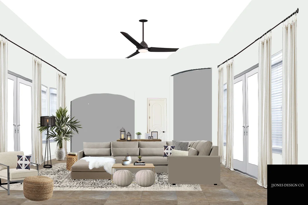
The client moved into their house in Arizona few years ago and hadn't done anything to change their home until recently. The client purchased the sectional sofa on their own but wanted to improve the overall look of the living room with a design that worked with their sofa. The client also wanted to make the space much lighter and more airy as well. I managed to select right pieces that would look great with the overall design. I selected a faded vintage rug and patterned pillows to make break up the neutrality in the room and make a statement of this space without ruining the look. We are pleased with the way it turned out. This is one of our favorite styles to work with but we don't get to work on this specific style with rustic elements often but glad the opportunity came by and made the client very happy. That is why it is one our favorite e-design projects.
Arizona Master Bedroom
Arizona Master Bedroom
I was rehired by the same client that I worked with on the Arizona living room e-design project above to work on their master bedroom project. I enjoyed working with the client because they didn't want the stereotypical American Southwest earth tones. The client wanted a similar style as the living room but wanted a pop of color to make this space a bit more fun. We selected rustic wood furniture that would work great with this specific style and choose turquoise as the pop - a nod to the Southwest. We also had to replace the tiles to rustic hardwood flooring to improve the look and provide some warmth and textural contrast to other areas of the home.
Now I am looking forward to continue work with clients on various e-design projects throughout this winter. Will share with you about that in this early spring 2018 so stay tuned.


